Brand Identity / Visual System
Korea Credit Data
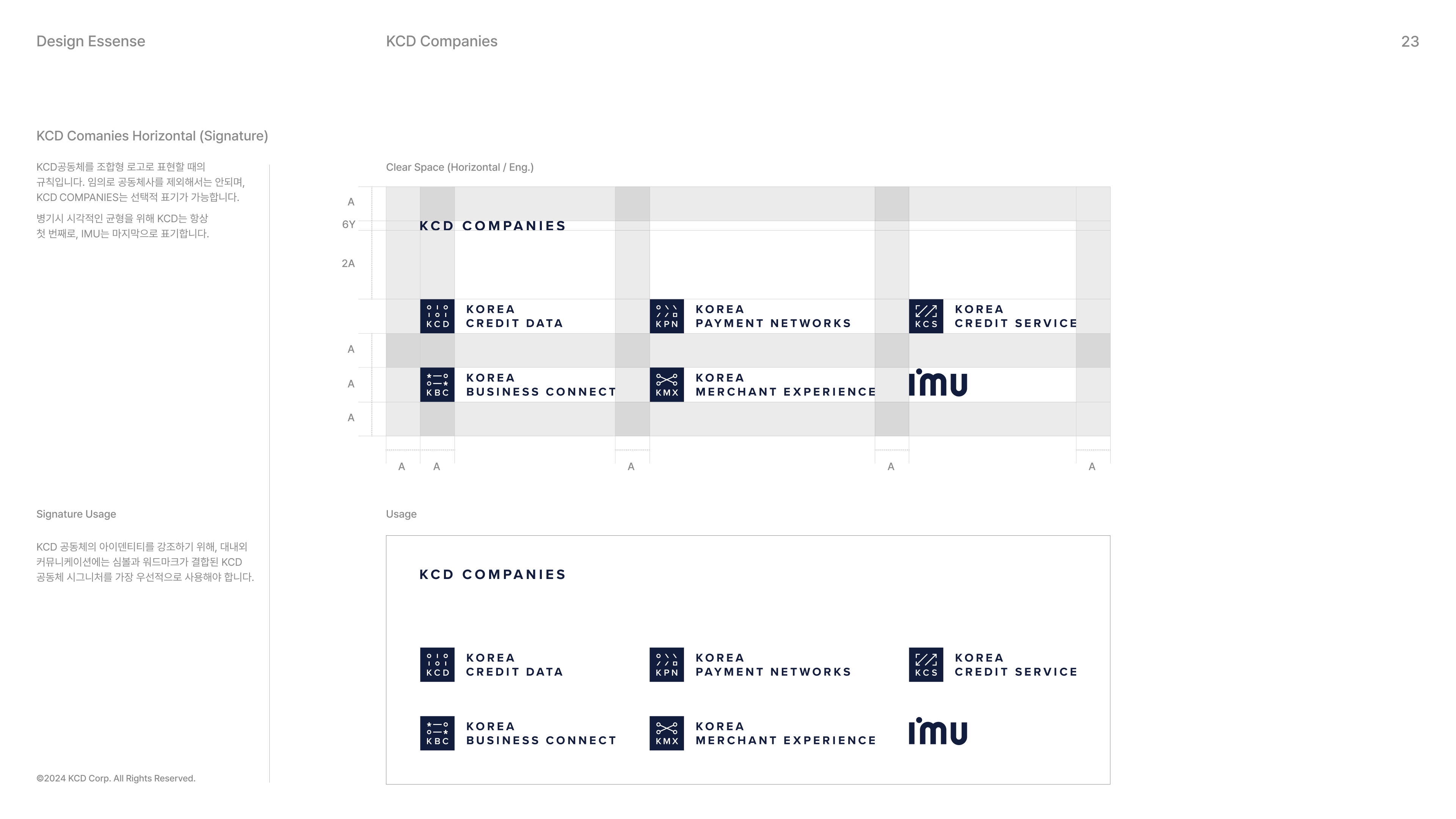
A brand identity system connecting six affiliates as one KCD community.
- Year / Duration
- 2023 · 5 months
- Role
- Research, Affiliate Interviews, Graphic Pattern System, Brand Applications, Print & Spatial Design
- Overivew
- A rebranding project that brings six affiliates together under a unified KCD Companies identity. The project was primarily developed by two designers, from affiliate interviews to defining the overall brand direction. My main focus was developing the graphic pattern system and brand applications that extended the character of each affiliate.

01 RESEARCH
How can six different companies become one brand community?
As KCD expanded across different business areas, it needed a shared identity that could bring its affiliates together while preserving the individuality of each brand.Through desk research and interviews with leaders and members of each affiliate, we explored their roles, businesses, and aspirations within the KCD community. These insights helped shape a direction that could connect the six brands while allowing each to retain its own character.
02 BRAND SYSTEM
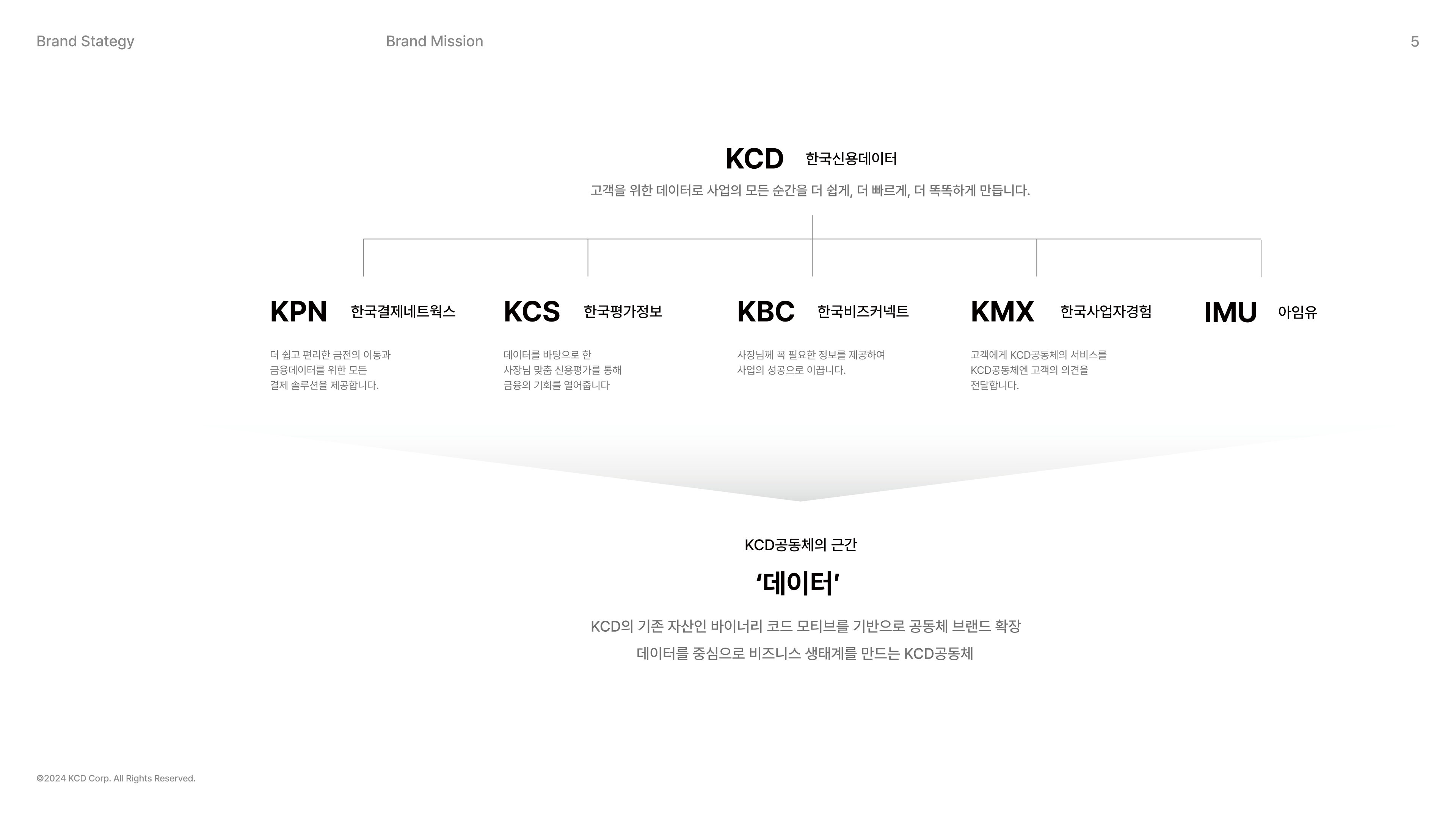
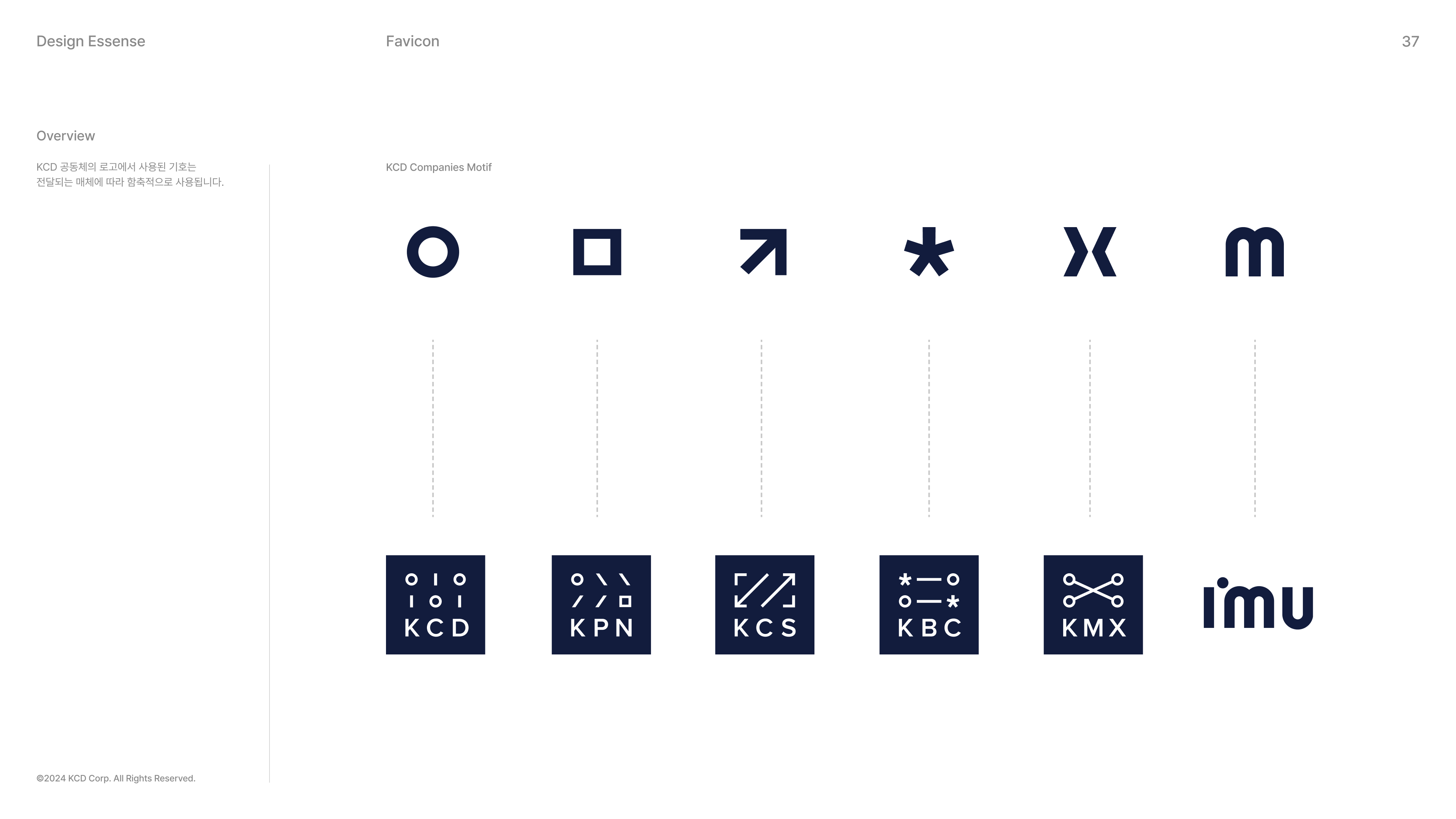
One source of data, six distinct identities.
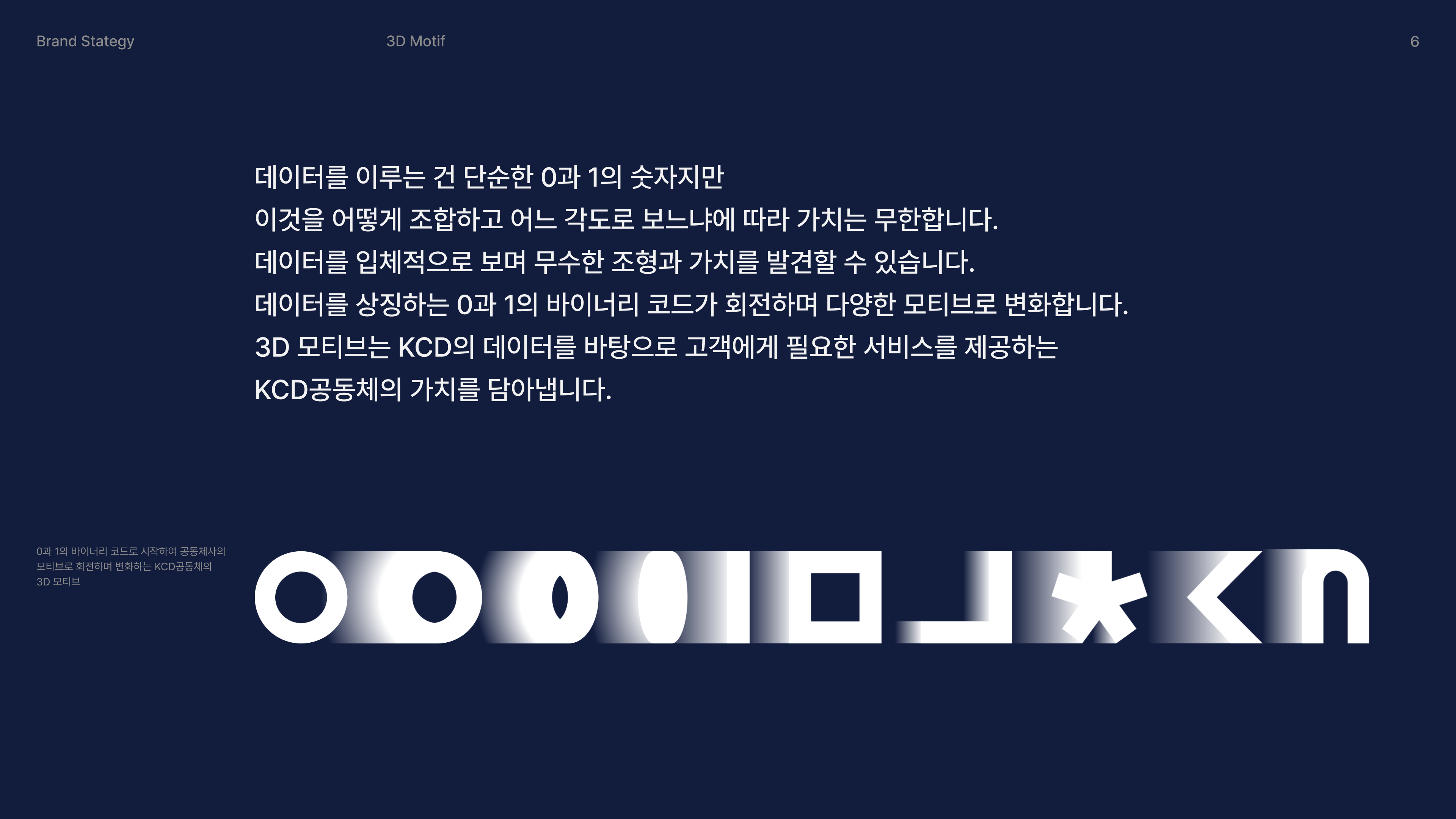
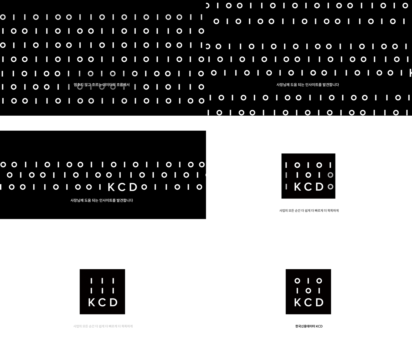
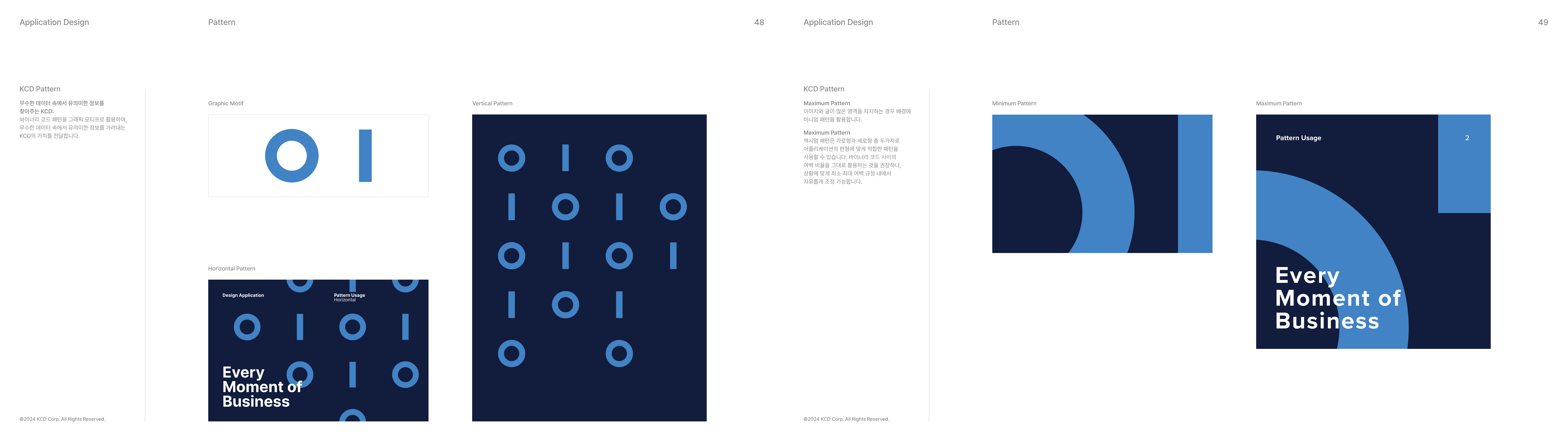
KCD's existing visual asset—the binary code of 0s and 1s—became the shared starting point for the brand community.Just as binary data can reveal different forms depending on how it is combined and viewed, the system begins with one visual motif and expands into distinct identities reflecting the role and character of each affiliate.
03 GRAPHIC SYSTEM
Different expressions within one visual system.
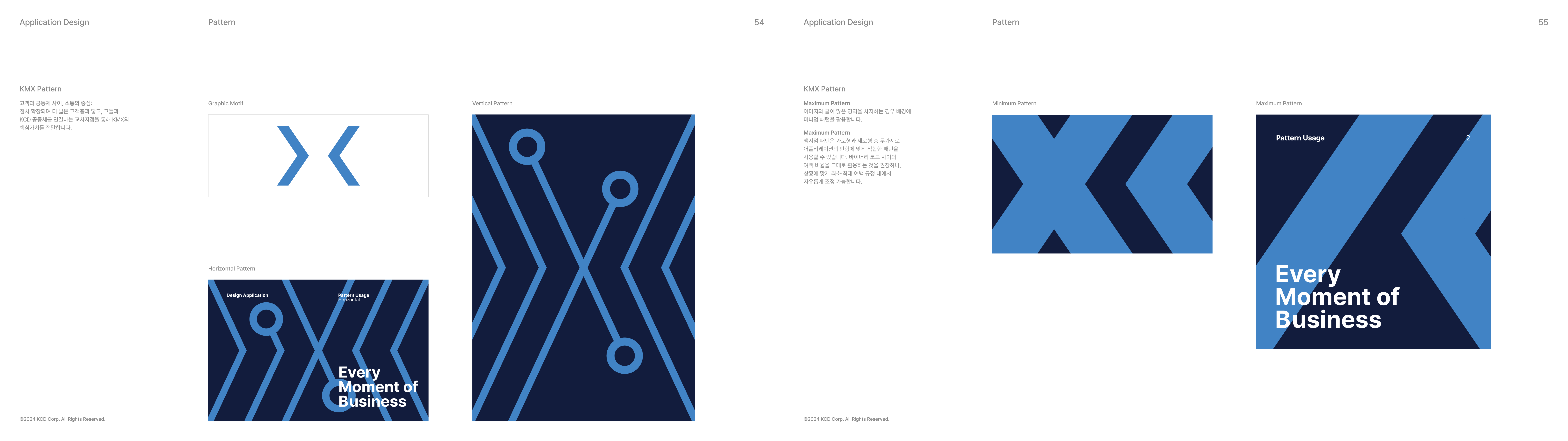
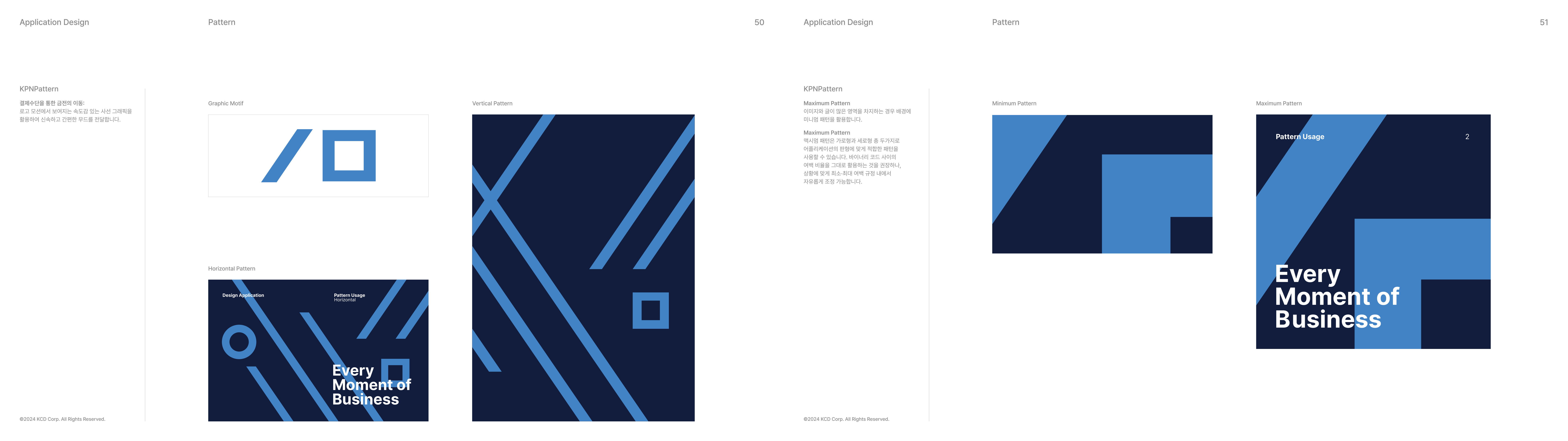
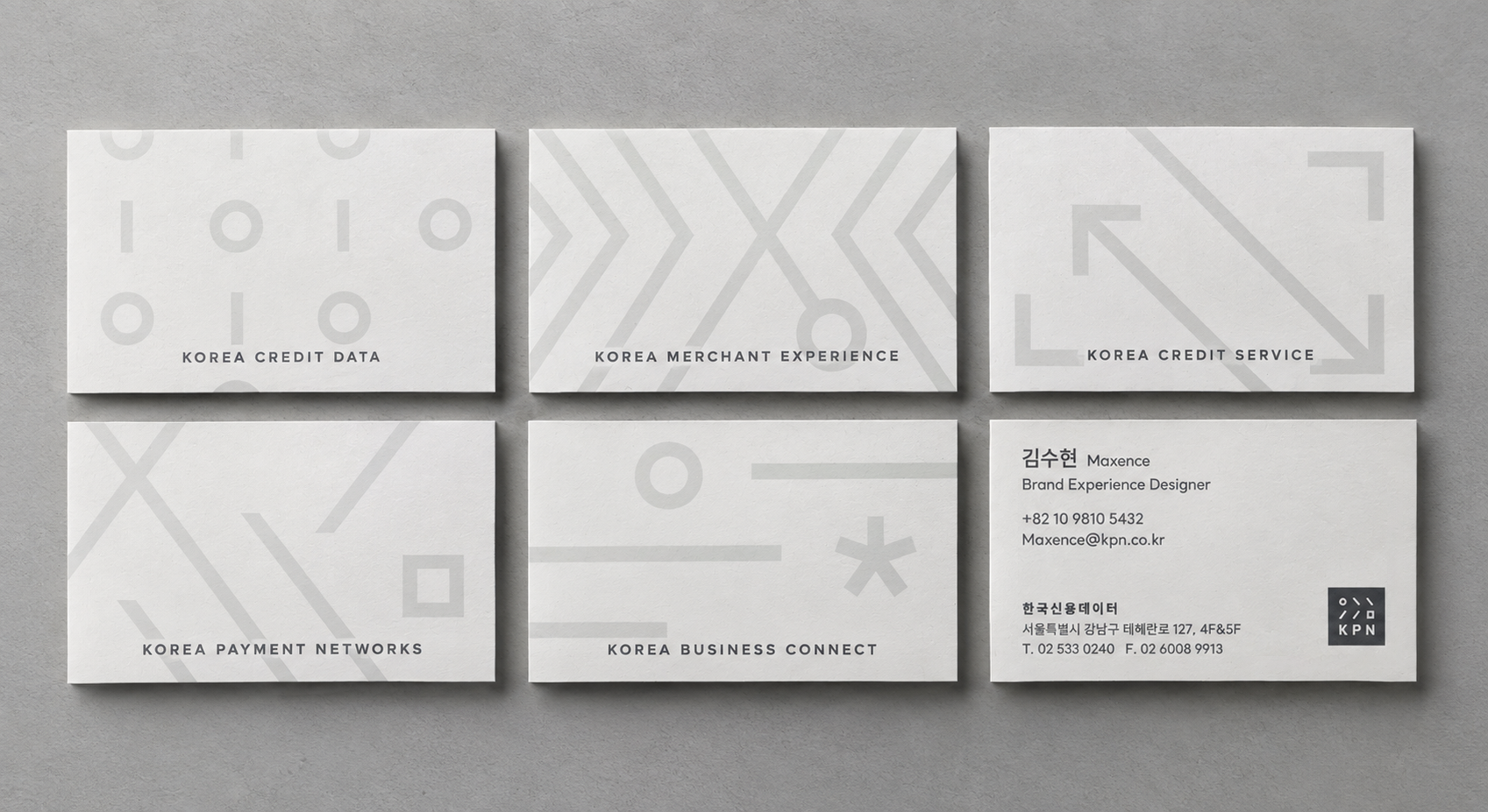
I developed a graphic pattern system that could extend each affiliate's identity across different brand touchpoints.Each brand motif—from KCD's binary code to KPN's dynamic lines representing financial movement and KCS's expanding forms representing financial opportunity—was translated into a flexible pattern while following a shared visual and color system.Rules for spacing, scale, and visual intensity allowed the patterns to adapt across formats while maintaining both the individuality of each brand and the consistency of the KCD community.
04 BRAND APPLICATIONS
Designing the experience, not just the graphic.
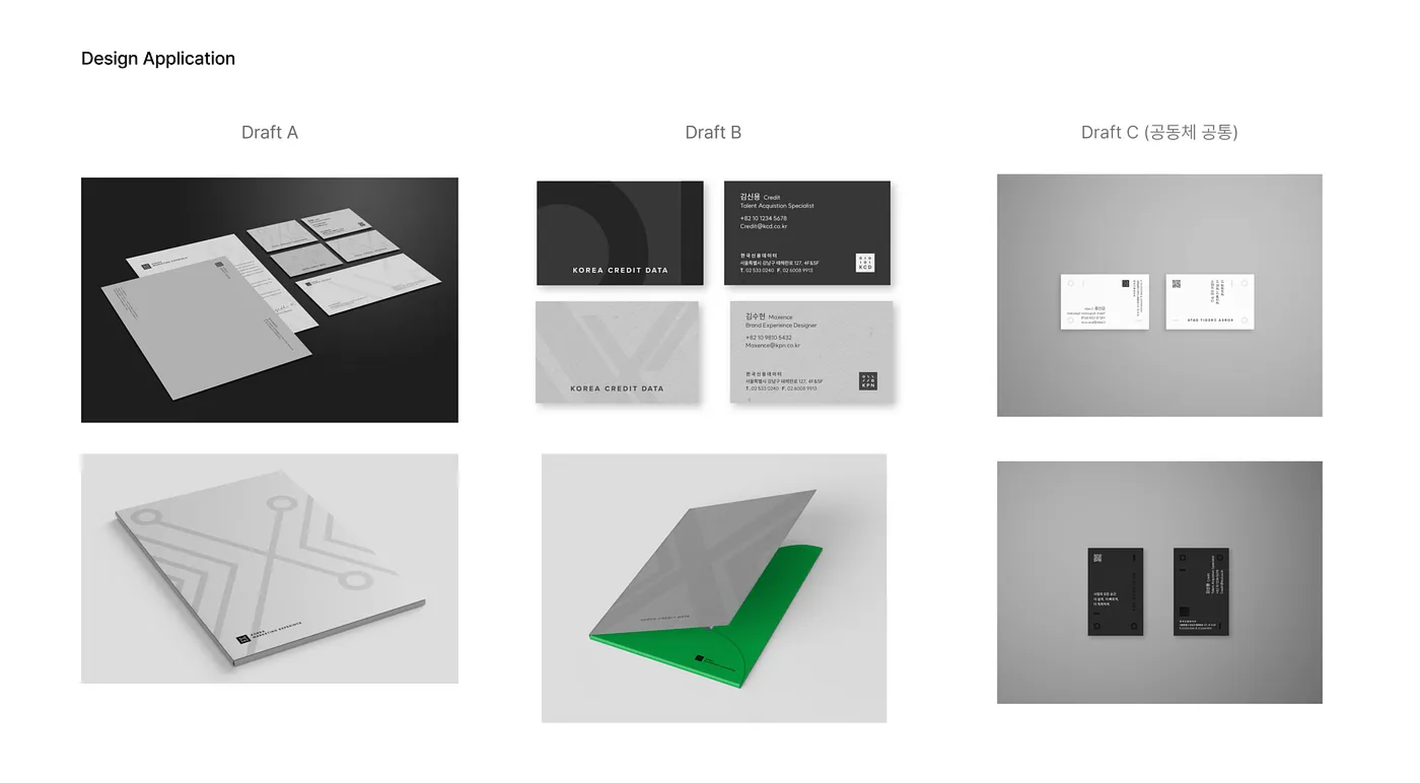
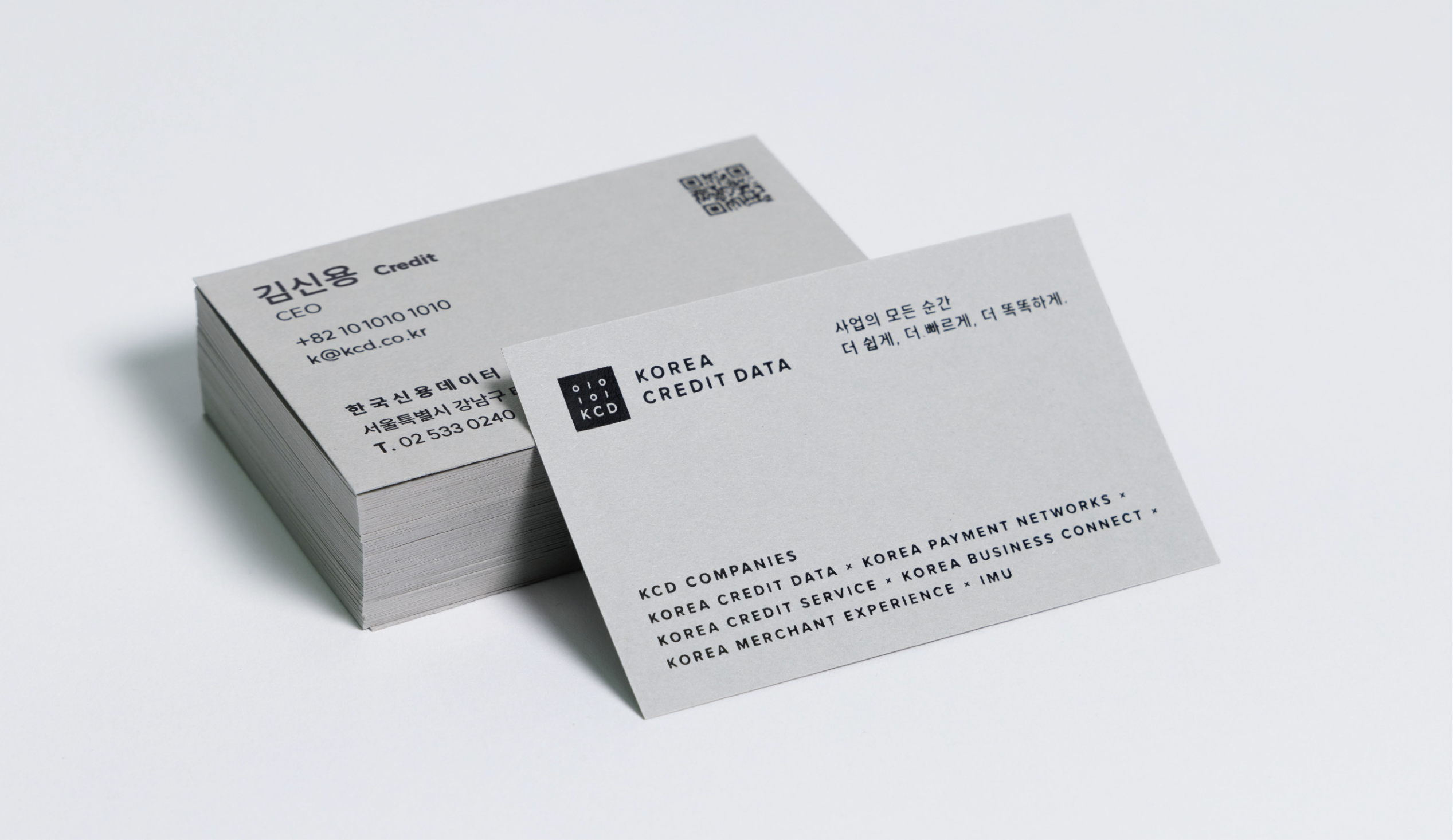
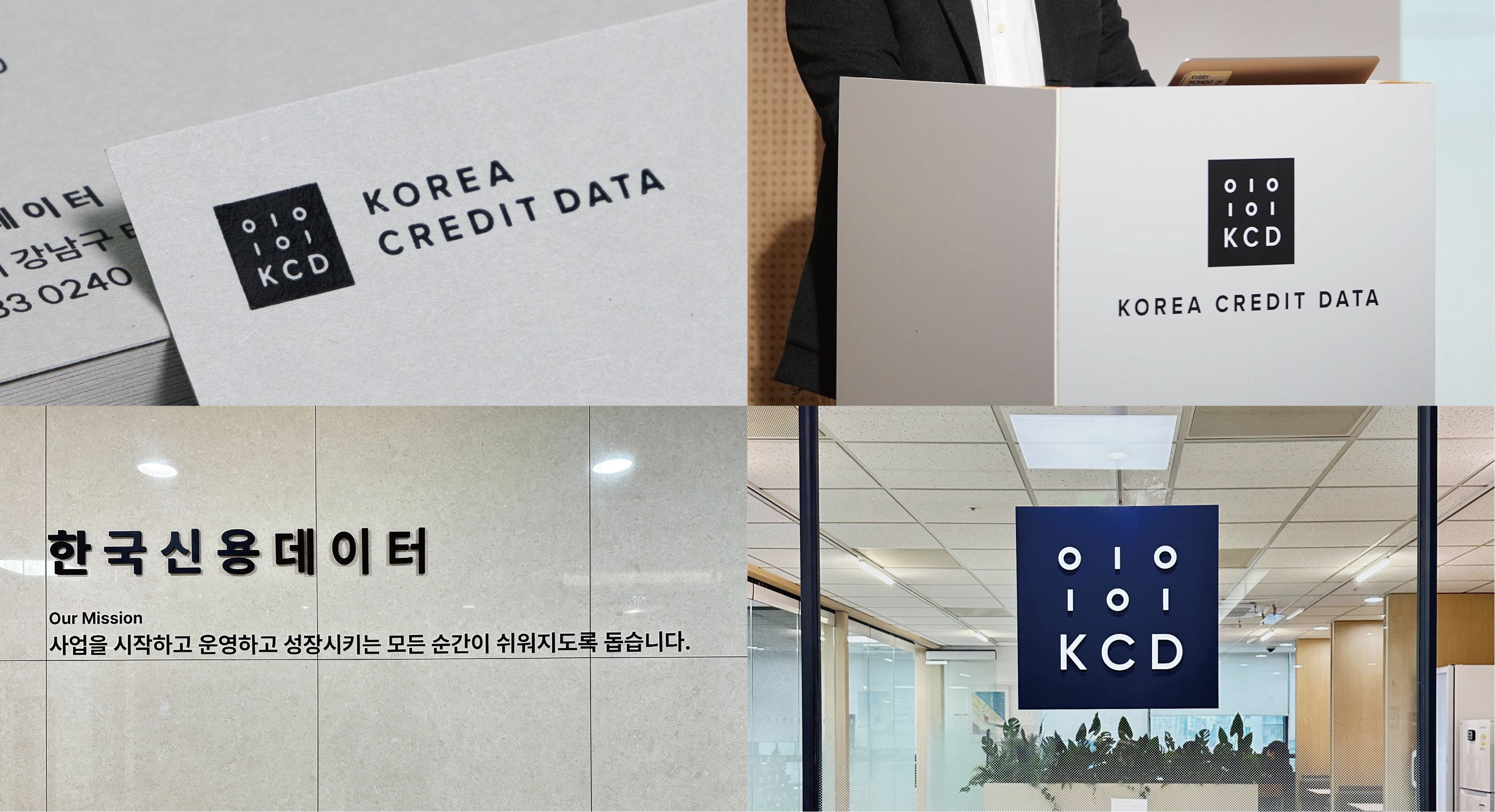
The initial business card concepts focused heavily on showcasing the graphic patterns. Through iteration, however, I began to consider applications not simply as graphic compositions, but as touchpoints that shape how information and brand messages are experienced.For KCD, the design evolved to emphasize the scale of the community and the hierarchy of its message, while applications for the individual affiliates gave greater prominence to their distinctive patterns.Material and color were also treated as part of the brand experience. We explored physical paper samples and selected a muted gray stock with an appropriate tone and weight for KCD.
05 PRESS DAY
Translating trust into material and space.
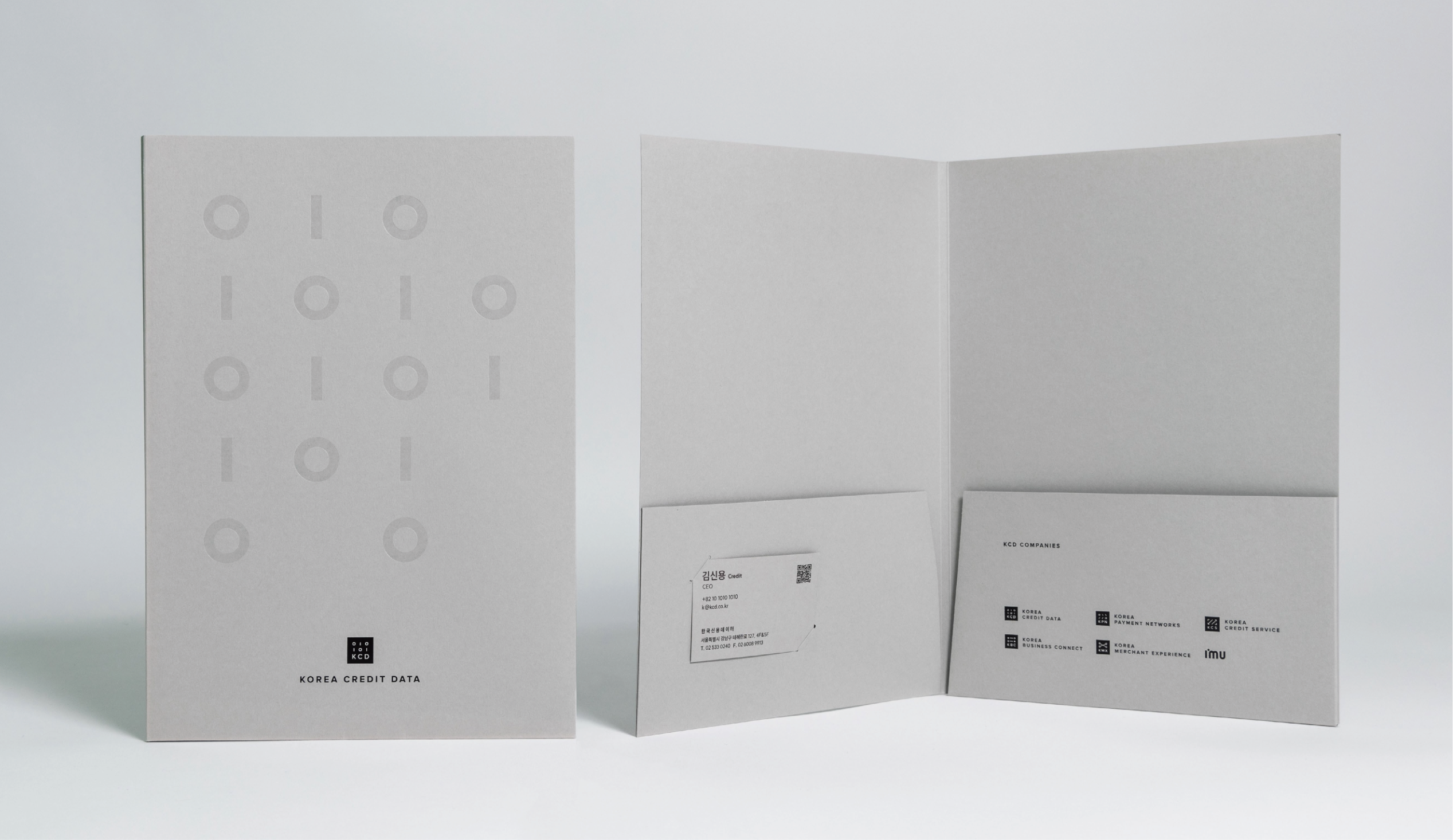
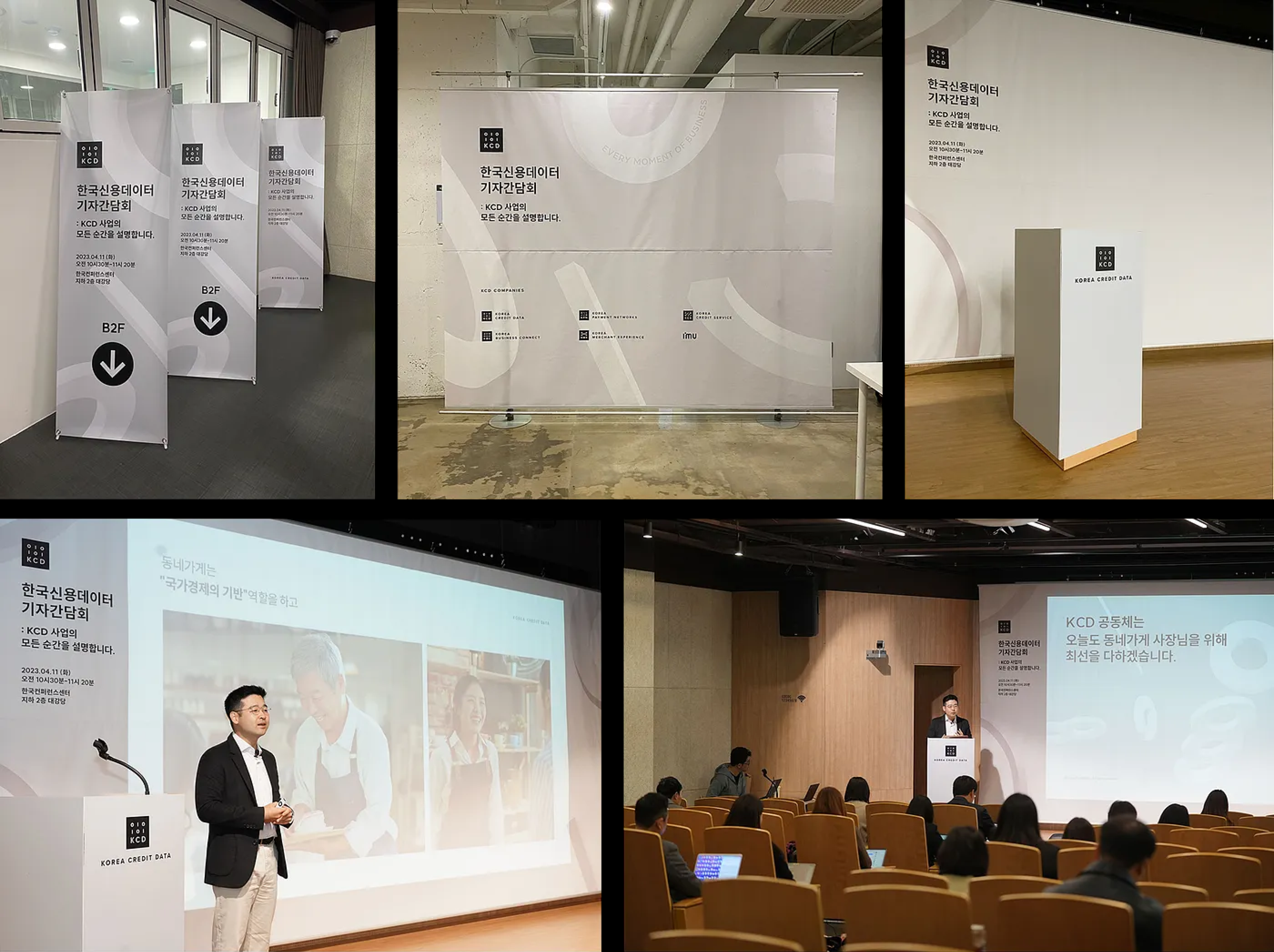
For the KCD Press Day, where the renewed brand identity was first presented publicly, I designed press materials and spatial applications including the press kit and event banners.Because the press kit was created for journalists, the material experience was designed to communicate credibility and substance rather than visual decoration alone. The graphic pattern was applied in transparent foil over muted gray paper, remaining subtle at first glance and softly revealing itself as it reflected light.
For the event space, the KCD Companies motifs were extended into dimensional graphics and viewed from multiple angles, allowing the renewed identity to move consistently from printed material into physical space.