Local / Spatial Branding
Piece Peace
A local brand system reconnecting vacant spaces into a workation town.
- Year / Duration
- 2023 · 2 weeks
- Project Type
- Self Initiated Project
- Role
- BX Design & Strategy
- Overview
- Piece Peace is a local branding project that transforms vacant houses and unused land in small towns into work and living spaces, connecting them into a unified workation town.
01 BACKGROUND
New ways of working, underused local spaces
The rise of digital nomadism and workation has opened up new possibilities for working and living beyond conventional urban offices.At the same time, smaller Korean cities face challenges such as youth outmigration and increasing vacant properties. Piece Peace explores how emerging work lifestyles could create new uses for these underutilized local spaces.
02 OPPORTUNITY
What if scattered spaces could become one connected town?
Rather than renovating a single building, Piece Peace proposes connecting vacant spaces across a neighborhood through complementary functions.Vacant houses become workation accommodations, while unused plots are transformed into shared office hubs. Together, they form a new local destination for working and living.
03 CONCEPT
Pieces of space, a new way of life
Piece Peace sees scattered vacant spaces as individual pieces of a larger whole.By giving each space a new purpose and connecting them into a workation town, the project proposes an alternative lifestyle for urban workers and new opportunities to activate underused spaces in smaller cities.
04 PILOT LOCATION
Imagining a workation town in Gimhae
Gimhae was selected as the conceptual location for Piece Peace. Its proximity to an airport and Busan offers regional accessibility, while the surrounding area provides a different atmosphere from Seoul.The project uses these characteristics to imagine a workation town built around the reuse of existing local spaces.
05 BRAND ARCHITECTURE
Different spaces, one connected identity
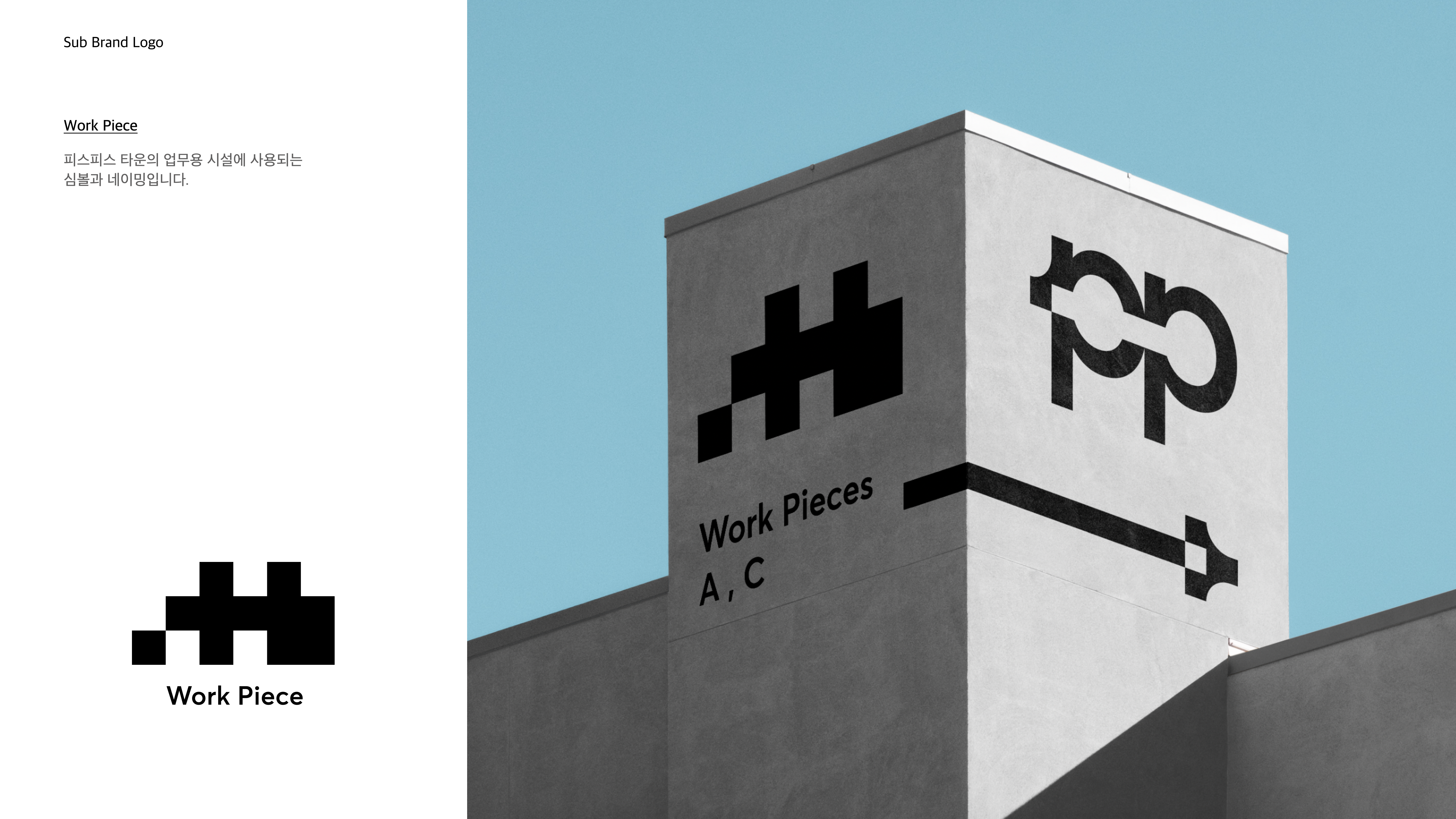
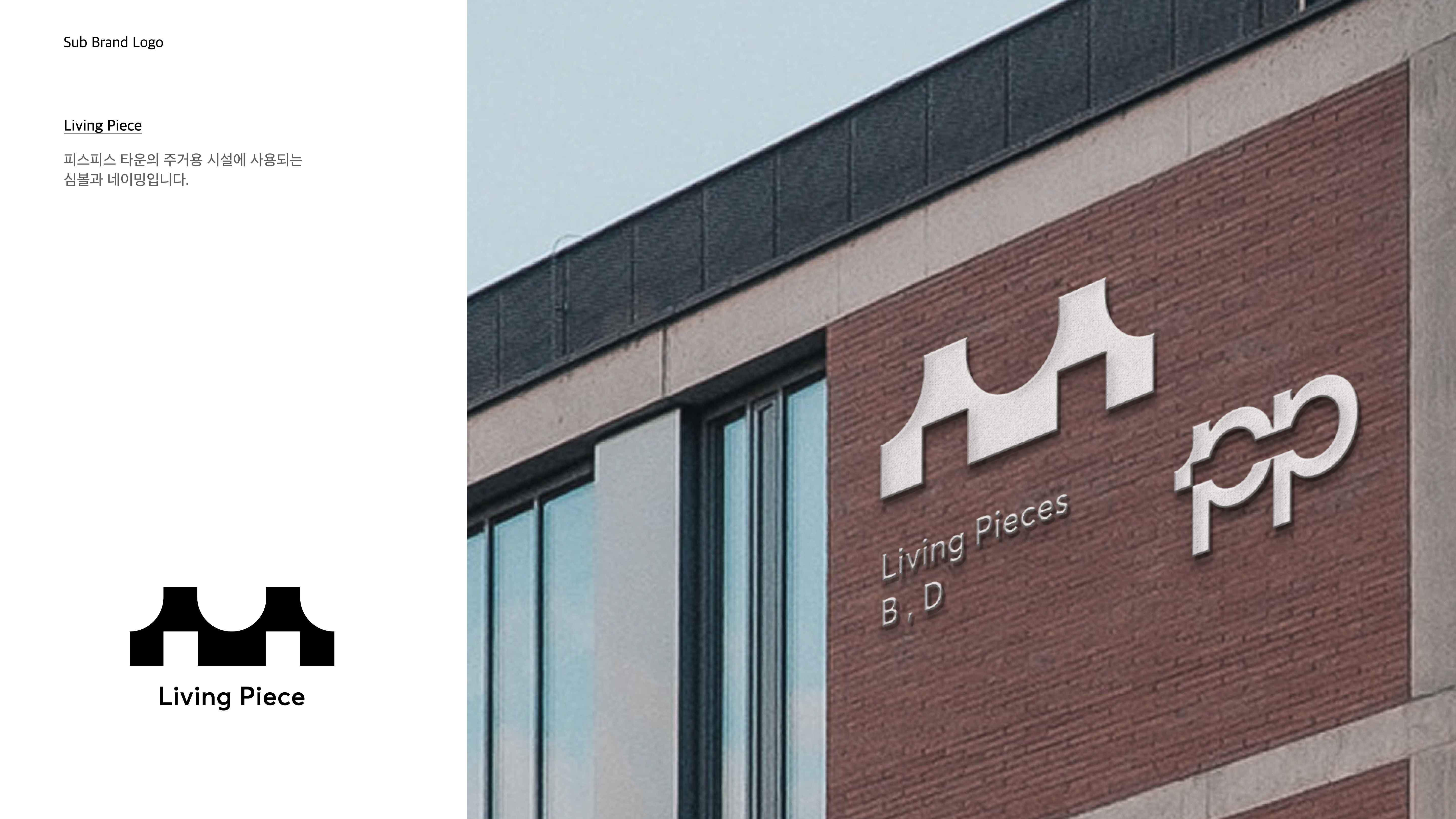
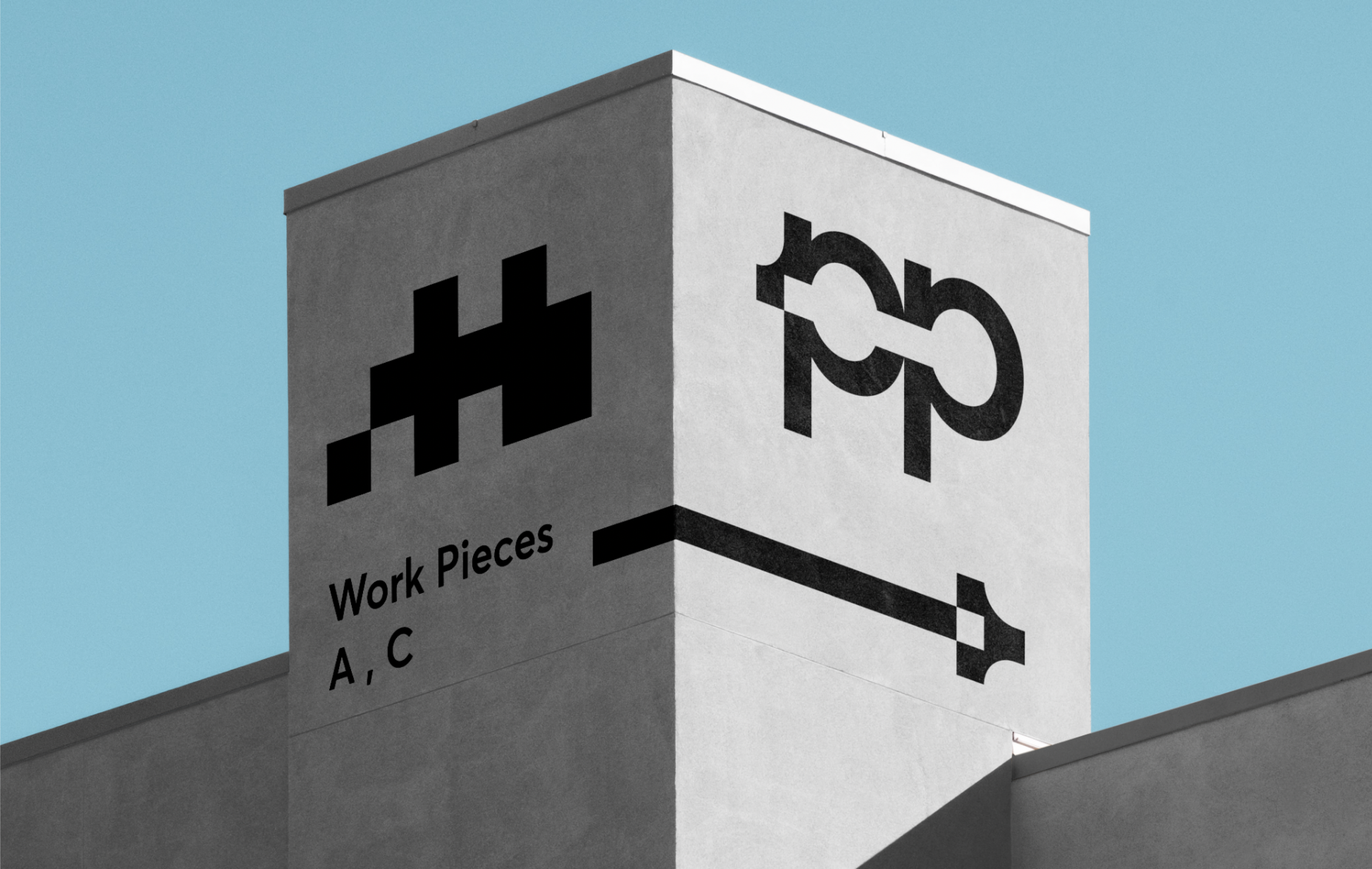
The brand consists of two complementary sub-brands: Work Piece, a shared office hub developed on unused land, and Living Piece, a network of accommodations created from vacant houses.Each has a distinct function and identity while remaining part of the unified Piece Peace system.
06 VISUAL IDENTITY
A visual language that connects fragmented spaces
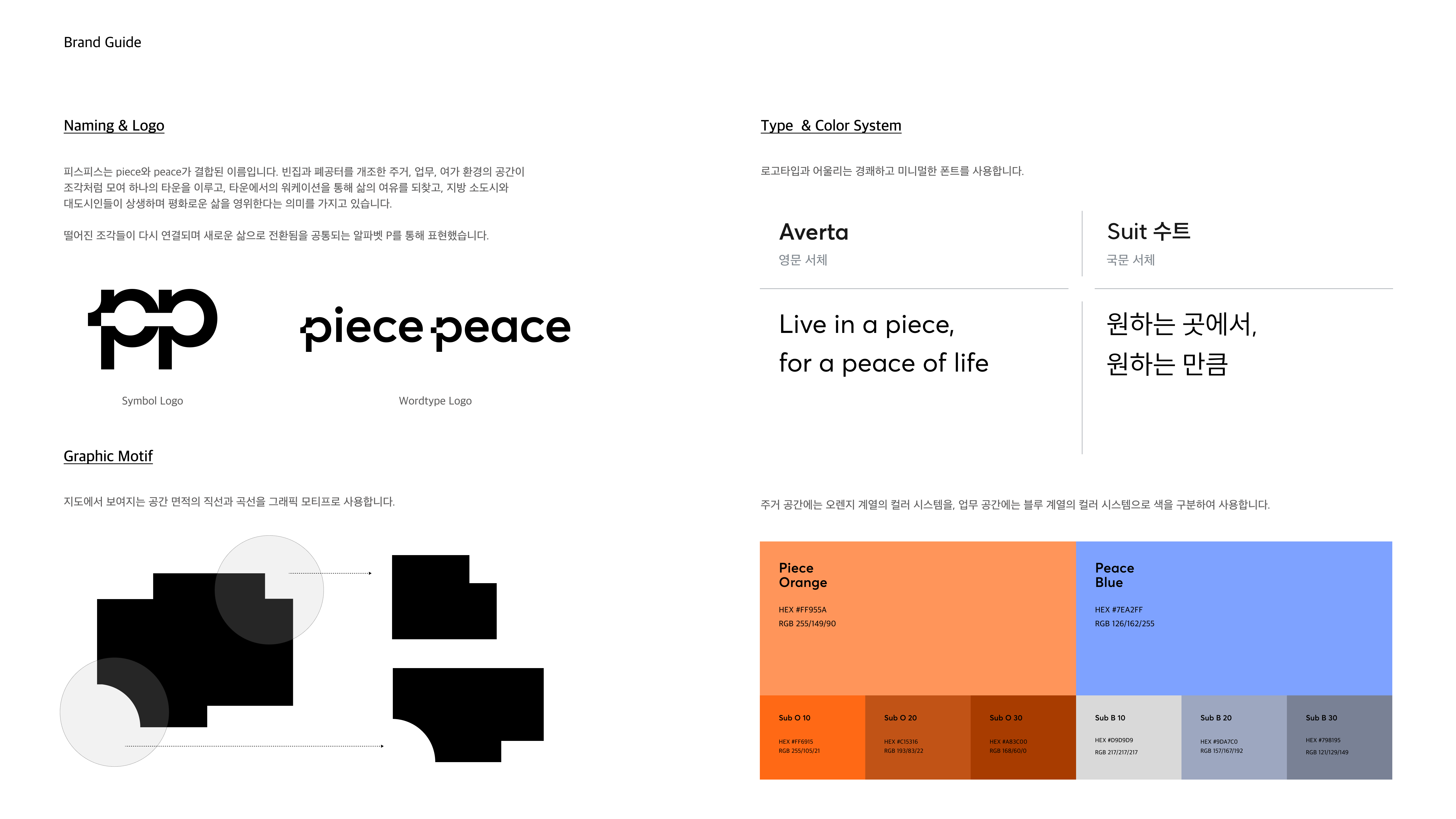
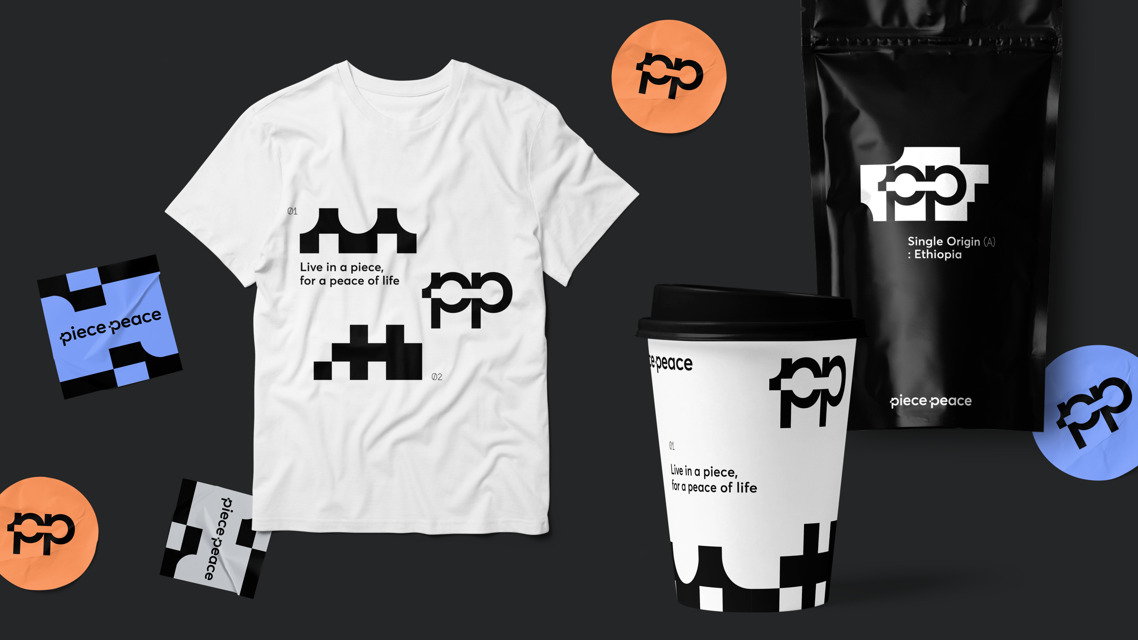
Inspired by fragmented areas on a map, the identity uses geometric forms that are cut and reconnected to represent the transformation of scattered spaces into one town.This principle extends from the main logo to the Work Piece and Living Piece symbols. Each sub-brand has a distinct form while sharing a unified visual language.
07 SPATIAL APPLICATION
Extending the identity into spatial experience
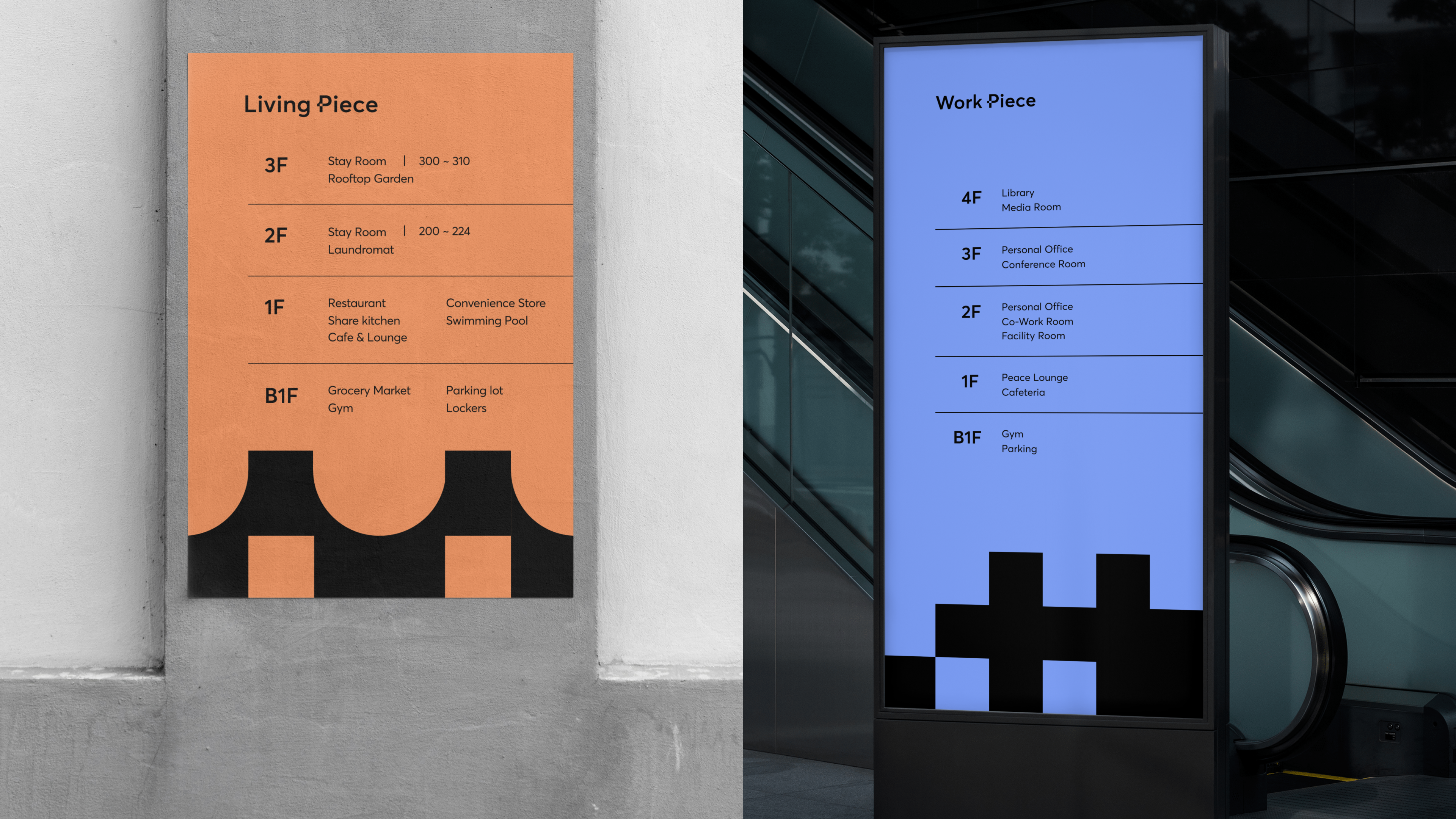
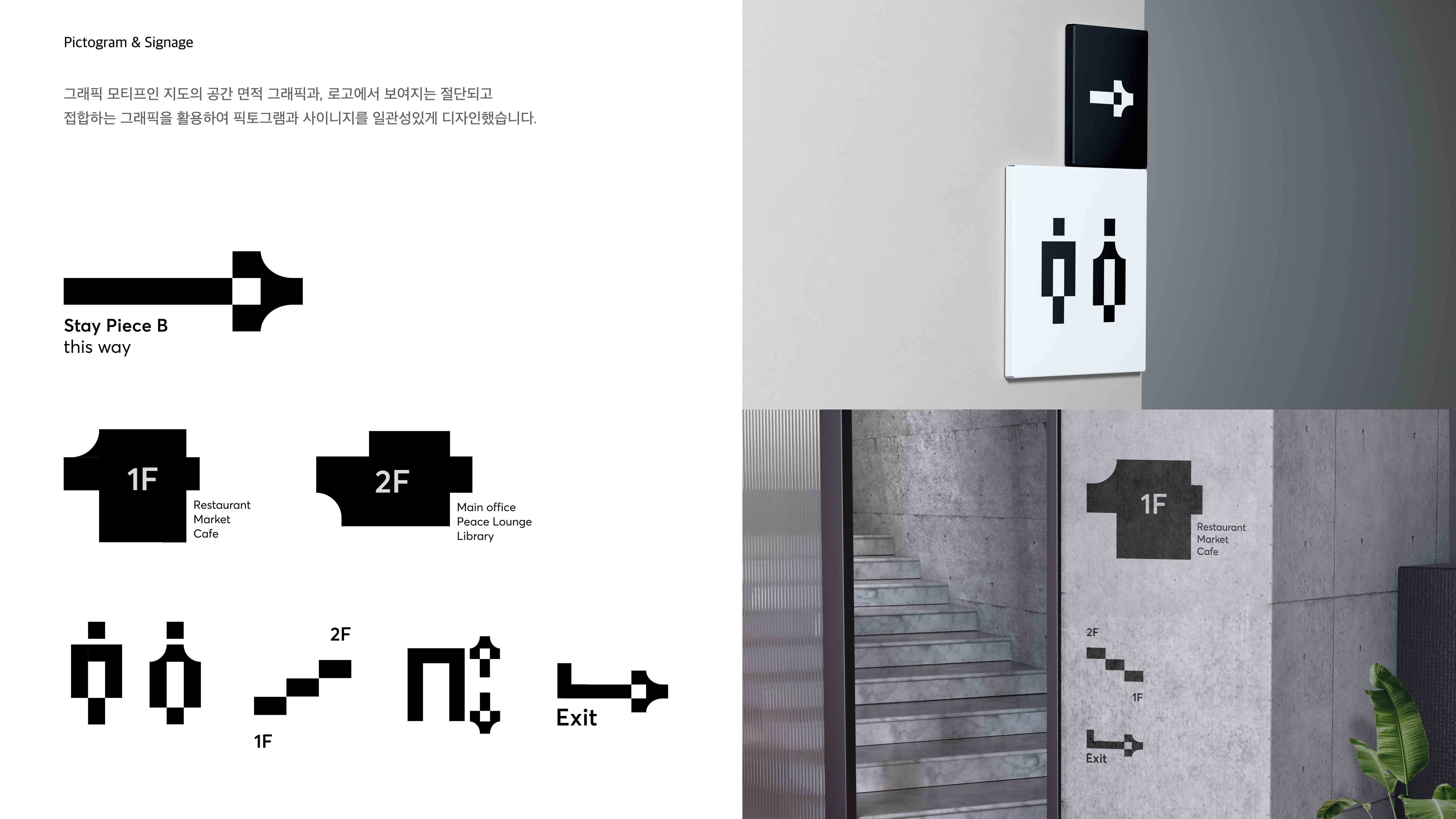
The visual system extends into wayfinding, directories, and pictograms across the town.Distinct colors and symbols identify work and living facilities, while the shared graphic language communicates their connection as parts of a unified destination.
08 BRAND COMMUNICATION
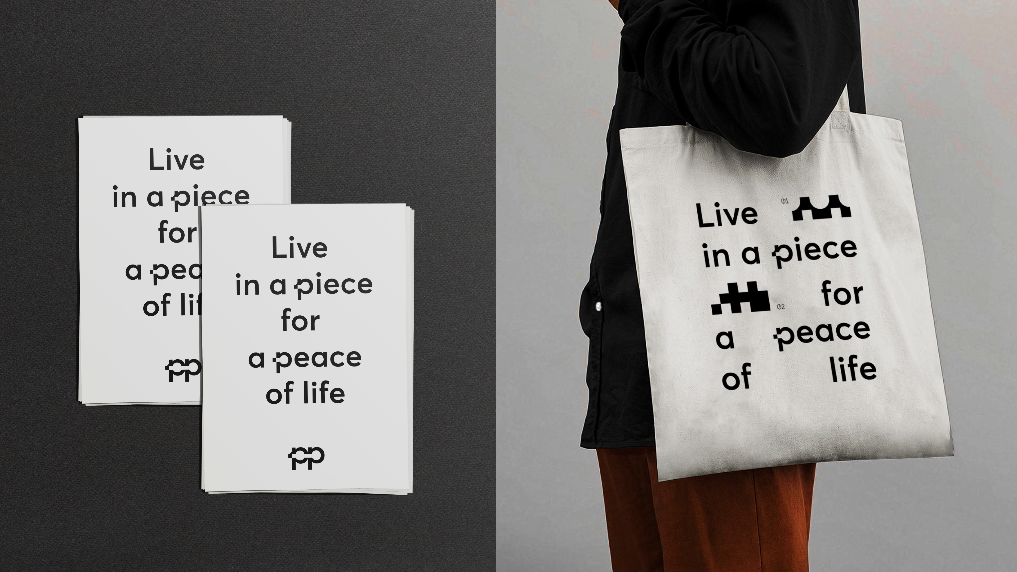
Live in a piece, for a peace of life.
Piece Peace presents workation as an opportunity to choose where and how to live, rather than simply working while traveling.
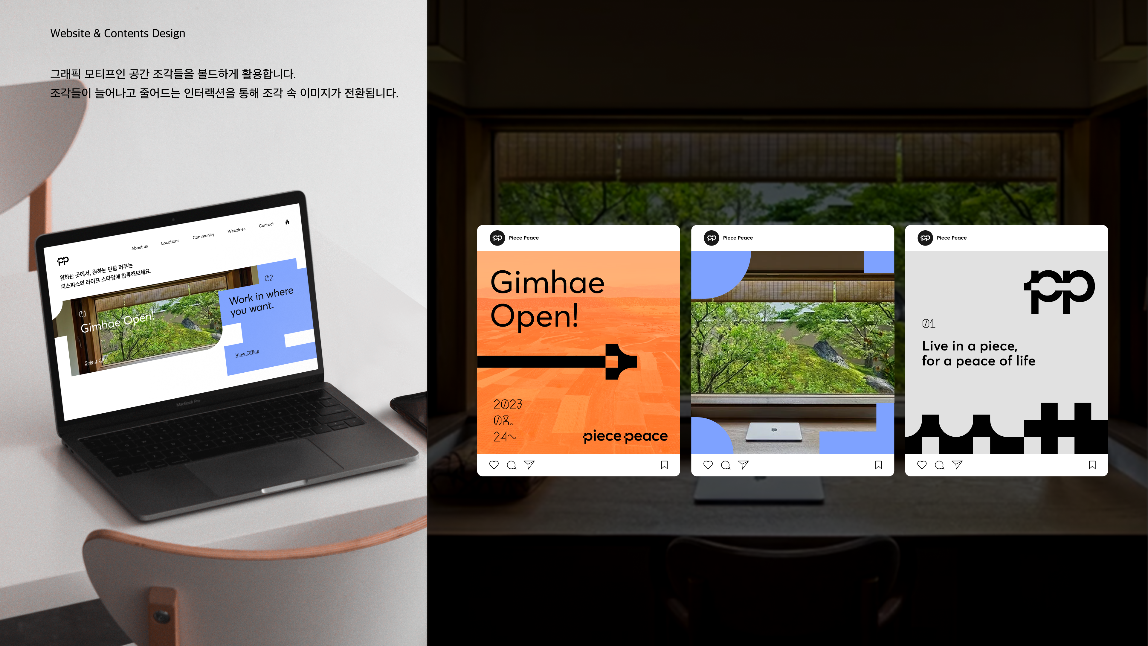
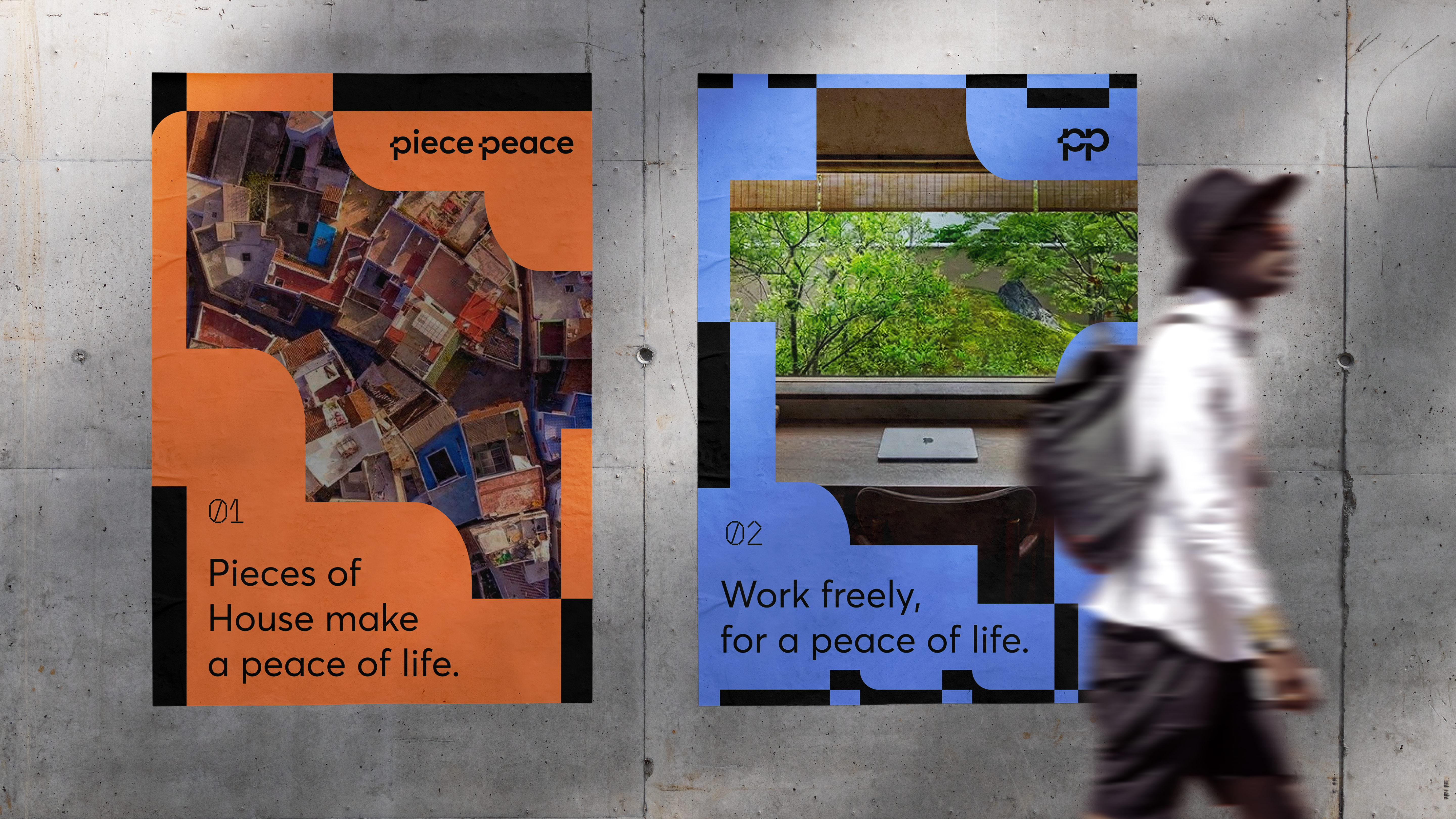
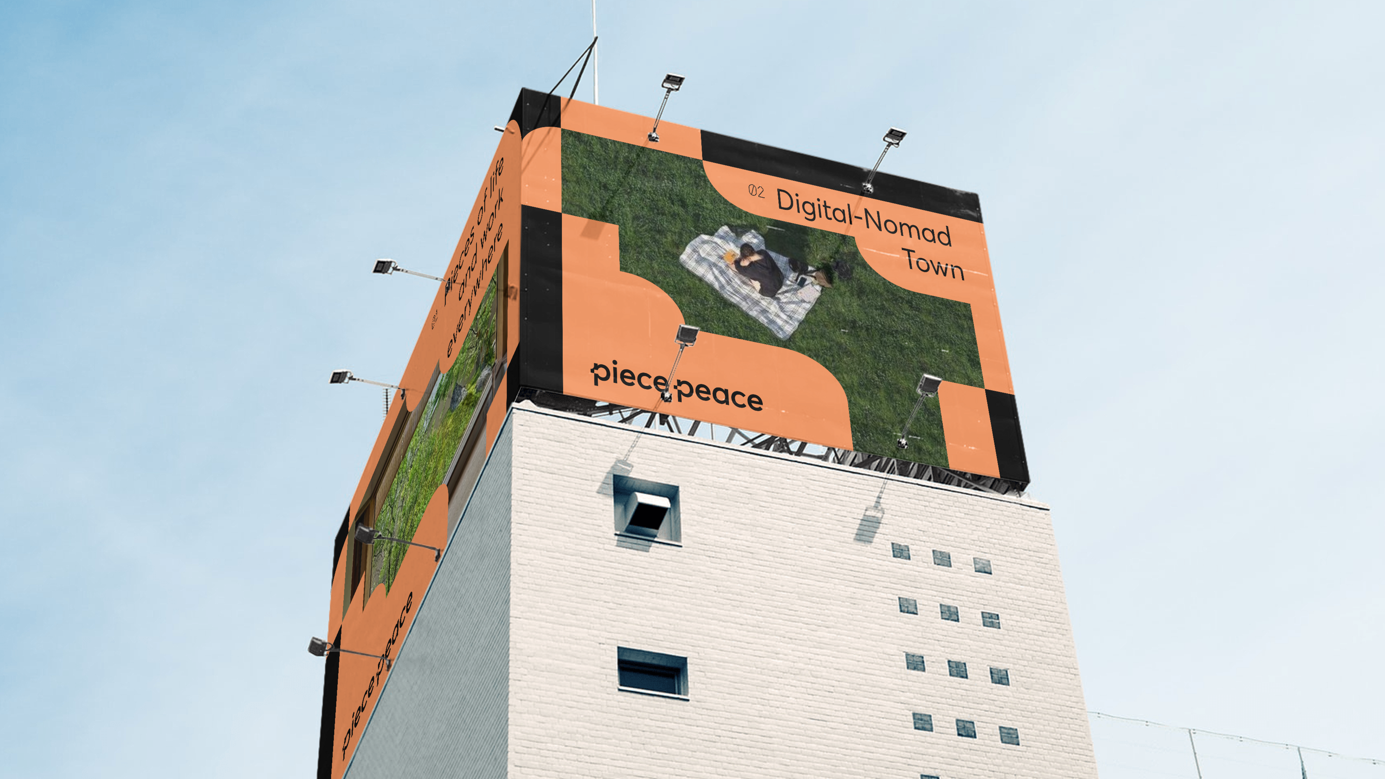
Its communication combines local scenery with the fragmented graphic language across the website, social media, and posters, expressing both the appeal of flexible work and the potential of local spaces.